
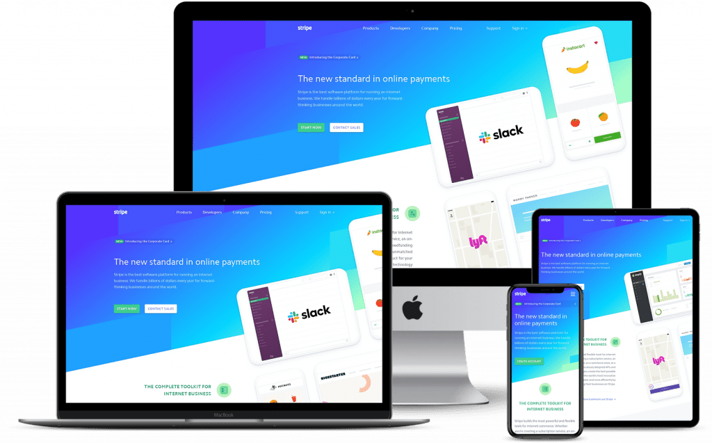
Have you ever visited a website from your phone, only to find that it’s impossible to navigate and looks a little (or a lot) wonky?
If so, the site you were on likely wasn’t built responsive. But what exactly does this mean?
What is responsive design?
Responsive web design (RWD) means that a website has been designed to adapt to various screen sizes and orientations based on certain breakpoints. The term was coined around 2010 by a web designer named Ethan Marcotte.
This is our way forward. Rather than tailoring disconnected designs to each of an ever-increasing number of web devices, we can treat them as facets of the same experience. We can design for an optimal viewing experience, but embed standards-based technologies into our designs to make them not only more flexible, but more adaptive to the media that renders them. In short, we need to practice responsive web design.
-Ethan Marcotte, A List Apart
In the time since, RWD has become more mainstream and more expected by site users. When a site is not built with RWD, it can result in disorganized content, lots of zooming in and out, and needing to scroll horizontally when viewing on a tablet or mobile phone. In other words, it’s just a lot more work than it needs to be for the user.
To sum it up, good responsive design is primarily made up of three things: a fluid grid, flexible images and text and media queries. Let’s dig a little deeper into what these each mean.
A fluid grid: Websites are designed using a grid with columns, but the grid can be created in varying ways. A fluid grid system takes into account changing screen sizes and keeps elements proportional as that size changes. This article does a great job of providing a visual explanation of this.
Flexible images and text: Text and image sizes that work on desktop are not necessarily the best option for mobile. A good responsive design takes this into account and may bump up font size on a mobile device since the screen is significantly smaller. Images may also have to be changed or dropped depending on the orientation of a device.
Media queries: This is code that drives the flexibility of responsive design. It is where the breakpoint of certain devices is set and determines how elements will display at that breakpoint.
Why you should care about responsive design
In today’s world, building a site for desktop users only is just unrealistic. The truth is that more than half of all website traffic is now mobile. As such, it benefits you to cater to that group of users, in addition to desktop users.
Here are a few reasons responsive design is so important.
1. It provides better UX. A good user experience is important for a number of reasons. If a user has a good experience on your site, they are more likely to return in the future. Of course, a good experience means different things to different people. But one huge aspect to keep in mind is that user experience isn’t just about how something appears. Rather, it’s about how it functions, which is why responsive design is vital. When designing your site, keep your target audience in mind and walk yourself through the journey they will ideally take on your site, from both a desktop and a mobile device. Then try to make that journey as seamless as possible for them so they enjoy the experience and return.
Design is not just what it looks like and feels like. Design is how it works.
-Steve Jobs
2. RWD helps boost your SEO. Google, among other search engines, is partial to sites that are designed responsively. According to Search Engine Journal, there are a number of reasons for this. For instance, Google takes into account the amount of time a user spends on a site. If a site is difficult to use, the user isn’t likely to stay there. Responsive designs also load faster, and load time affects SEO. Another factor that comes into play is duplicate content. In some cases, a company may forego responsive design and creates a whole other site for mobile users. Without responsive design, there is a larger chance of having duplicate content, which causes your SEO to take a hit.
3. It’s less work. As mentioned above, in some cases, companies create two separate sites — one for desktop users and one for mobile. This means both sites need to be maintained and updated and paid for. But with responsive design, there is only one site to worry about. It’s a win-win, because it’s easier and cheaper for you, and the user gets a better overall experience.

