Often while in the planning stages of a vacation, travelers will look to a state or city’s website to determine if it is a place they’d be invested in visiting. The way a website presents what its location has to offer can sway whether or not someone chooses to visit. When it comes to tourism, a website should make the user excited to learn more, curious about the happenings and, ultimately, interested enough to visit and experience it themselves. Keeping that in mind, I’ve compiled a list of some of the best tourism website design inspiration from within the United States.
Table of Contents
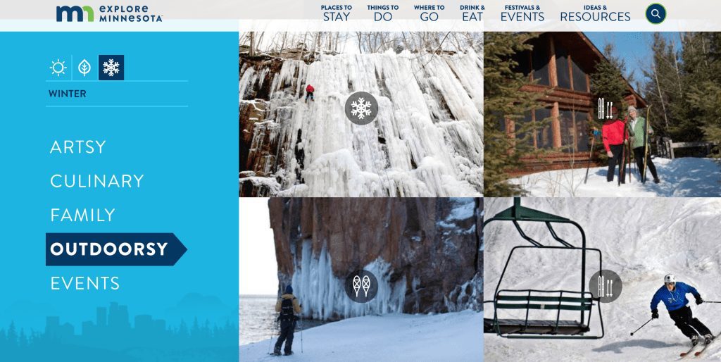
Explore Minnesota
Outsiders often know Minnesota for its seemingly never-ending winters. But rather than sweep the season under the rug for fear of it being unappealing, the Explore Minnesota website embraces it as a draw to the state. The site is designed for ease of use by allowing visitors to select a season and type of activity, narrowing down the list of options quickly.
Visit Arizona
Arizona zones in on giving users a personalized experience, allowing them to drag sliders depending on what they are most interested in. Users can indicate whether the activities that appeal to them are city- or nature-based, relaxing or active, child or adult-oriented and more. As they change the sliders to indicate interest level, the suggested activities change accordingly.

Travel South Dakota
South Dakota takes a personalized approach, likely utilizing a user’s IP address to determine which state to use as a greeting on the site’s homepage. Upon scrolling further down the homepage, users will continue to see a personalized approach, based on the state they are visiting the site from. Much of the site’s homepage touts South Dakota’s catchy “Great 8,” which are eight of the main draws to the state, including Mount Rushmore and the Badlands.

Door County, Wisconsin
As a Wisconsin peninsula that juts into Lake Michigan, Door County, with its 300 miles of shoreline, is all about the water. The website embraces this with various graphics in cool blue and green tones, as well as a cabin-esque logo. The home page allows the visitor to quickly create a potential itinerary by entering travel dates and selecting activity, dining and lodging interests.

Miami and The Beaches
Right off the bat, the city’s website encourages visitors to join the conversation and get involved by touring the #FoundInMiami hashtag on the home page. Further down, the pages features a feed of social media posts tagged #FoundInMiami. Additionally, aware that a major draw to the city is the year-round warm weather, the site’s homepage features current weather and live webcam views of areas in the city.

Visit Telluride
A town of about 2,500 nestled in the Rocky Mountains, Telluride focuses on keeping it simple — and the city’s website communicates that. The menu is clean and to the point, while the featured images zero in on what the community has to offer visitors. Users can toggle between winter and summer icons at the top, depending on when they will be visiting, and the attractions change accordingly.

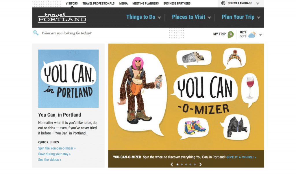
Travel Portland
Right off the bat, Portland makes it know that it’s a city recognized for its quirky and relaxed vibe. On the homepage, it features the “You Can-O-Mizer,” a unique approach to featuring what Portland has to offer. The colors, fonts and graphics work together to emit a funky feel, while also effectively communicating helpful information for visitors.
This Is Cleveland
Cleveland takes a less common approach by going with a black background and white text. While such a design could feel overwhelming, This Is Cleveland does a good job of choosing fonts that are readable and spacing out content so as not to make it appear cluttered. The homepage text communicates that Cleveland is a city of contradictions, and the design aligns with that message.

Visit Savannah
This site takes a much more simple and elegant approach than most, effectively portraying southern charm and a mix of modern and old-fashioned. The photography is a focus, as it’s light, bright and eye-drawing. The font pairings, a serif and san serif, communicate a clean, upscale feel and work well together on the white background. Simple design elements, such as the dividers, add to the elegant and modern appeal of the site and allude to the visitor that the city is the same way.

Tourism website design inspiration for you
Of course, these sites aren’t the be all, end all of tourism website design inspiration. Depending on the location being represented, some of these ideas could work, while others may not make the most sense. In the end, it comes down to what makes the most sense for your location and what gives the user the best experience.

